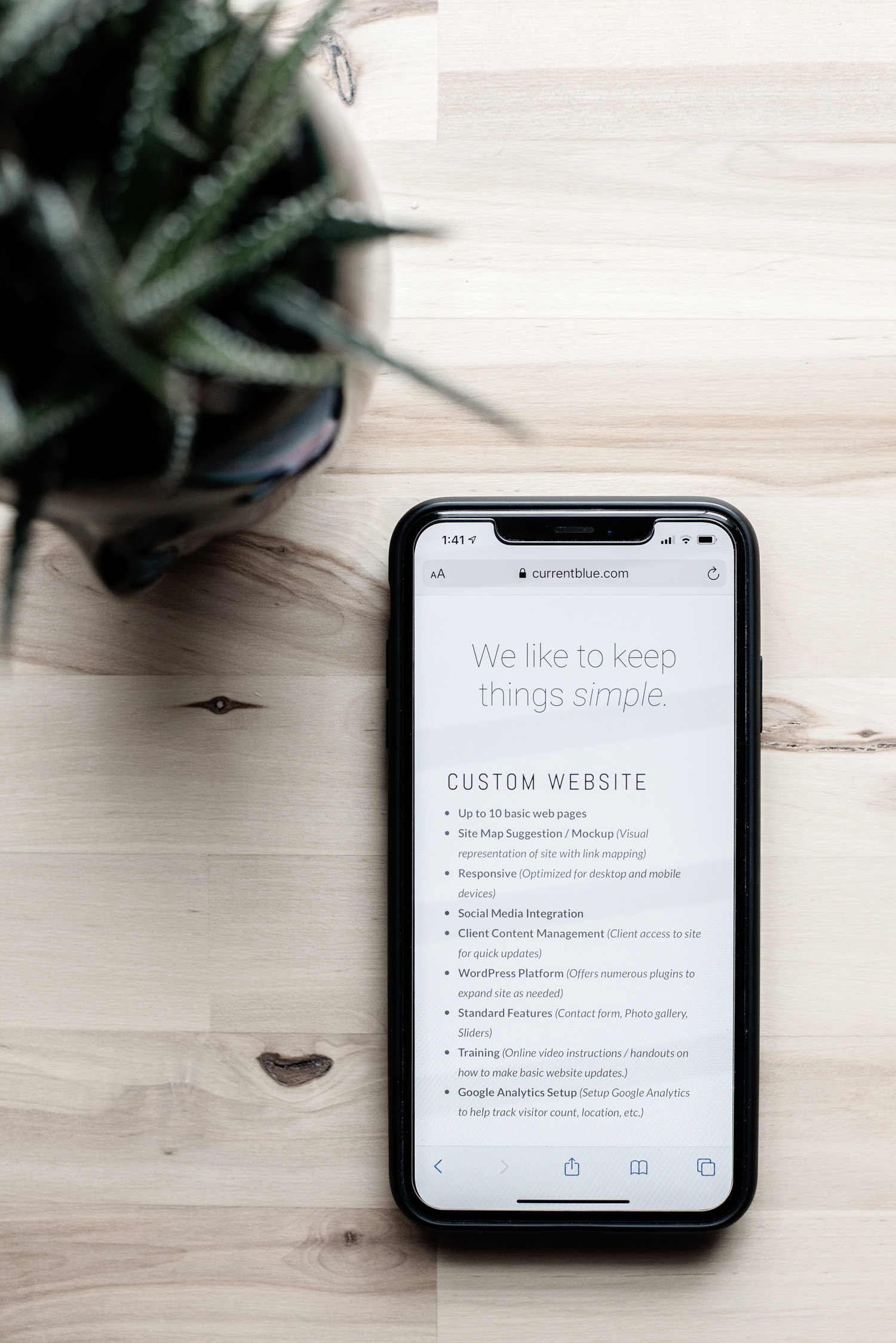
Responsive Design
What is Responsive Design?
Have you ever been to a website that looked awesome on a computer but less than awesome on a phone? So have we. Frustrating isn’t it? If you’ve ever tried filling out a contact form that is partially cutoff with a ghost ‘submit’ button, you get it. We believe websites should not only look beautiful, but work correctly on all of the devices we use. This is where responsive design comes in. We could bore you with talking about the proportion-based grids happening in the background but we won’t. The short answer is responsive design allows your site to adjust and adapt to different screen sizes, and we think that is really important.
Why Does it Matter?
According to current statistics, roughly 50% of your site traffic will be from mobile devices. To repeat, half of the people visiting your site will be on a mobile device. If your site isn’t responsive, Susie might just move on when she can only read half of your page headings. She may even throw her phone out the window during her pursuit of the elusive ‘submit’ button on your contact form. Either way, that positive first impression is gone…and that contact form never got submitted. You may have just lost a valuable client. That’s why we believe that it is critical that your website look beautiful and function on all devices.
We build responsive websites.